Saving tech bandwidth by implementing a design system
My journey of developing and consistently maintaining a design system that resulted in saving tech bandwidth. Also allowed designers to concentrate solely on problem-solving, as the UI design process has been greatly simplified.
My role
Research & Design
Timeline
In process always
Collaborators
Tech team
Outcome
Saved a lot of time
Planning
The first step was a comprehensive audit of our existing UI components. Given our focus on healthcare experts, it was crucial to adjust our UI elements to convey [[trust, safety, and a sense of calm]]. This meant reevaluating everything from color schemes to the geometry of components to ensure they resonated with our target users' needs and preferences.
I planned I'll first define foundational elements and then create components out of it (pretty simple approach).
01
Foundation
Typography, Colors, Spacing
02
Components
Buttons, controls, cards, bottom sheets, tooltips, etc.
Crafting Kennar Health Design System
ONE LINER SOMETHING
Colors
I introduced a design tokens approach to standardize our color palette across both the tech and design realms. By naming our colors systematically and utilizing local variables in Figma, we bridged the gap between dark and light modes, facilitating effortless transitions between themes. This not only streamlined the design process but also enhanced visual consistency across our application.


Typography
To address our typographic chaos, I established a clear hierarchy and purpose for our fonts: [[[Montserrat ]]] for headings, subheadings, and calls-to-action, and Open Sans for all other text types. This decision was informed by their readability and emotional impact, crucial for engaging our audience across large phones, and small to extra small devices. This thoughtful typography strategy significantly improved our content's accessibility and user engagement.

I defined a type system tailored for three types of devices: Large, Small, and Extra-Small. Different devices possess unique viewing contexts and limitations. What may appear visually pleasing on a large phone could feel cramped on a smaller screen, and vice versa.
Units : Radius and Spacing
Implementing a token-based system for spacing and radius allowed us to create a more structured layout and visual rhythm throughout our app. I’ve created variables to define rules for Spacing and Radius for use throughout the design system. Note that these are a different type of variable to the Color variables used above, here we use Number Variables.
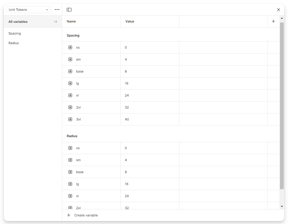
This is extremely useful for improving consistency and increasing the speed at which we can design for all types of devices as they don't need to find the perfect corner radius and spacing for a device.

Components
Implementing a token-based system for spacing and radius allowed us to create a more structured layout and visual rhythm throughout our app. I’ve created variables to define rules for Spacing and Radius for use throughout the design system. Note that these are a different type of variable to the Color variables used above, here we use Number Variables.
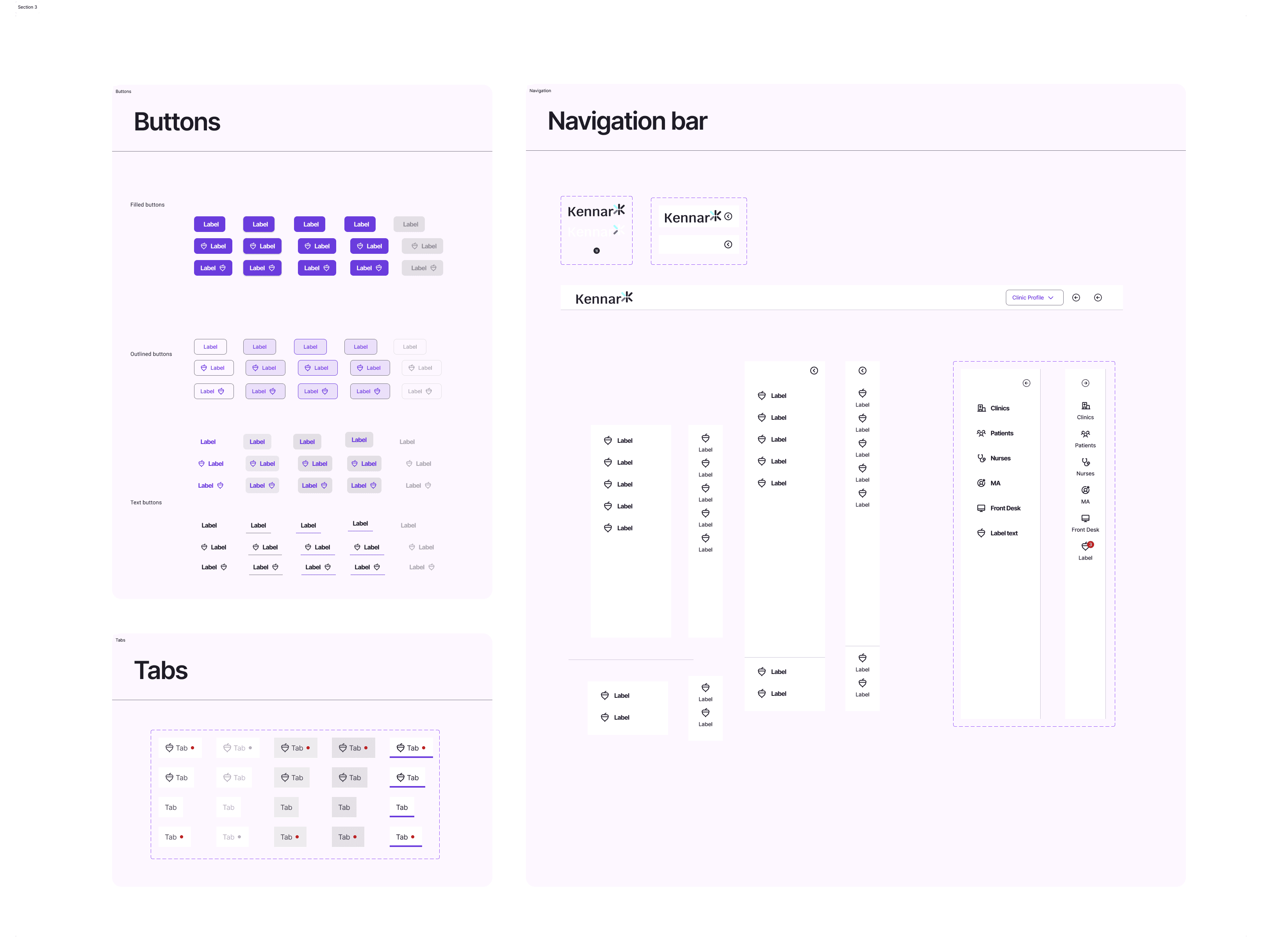
I designed only those components that were required at that time.
Implementation and Collaboration
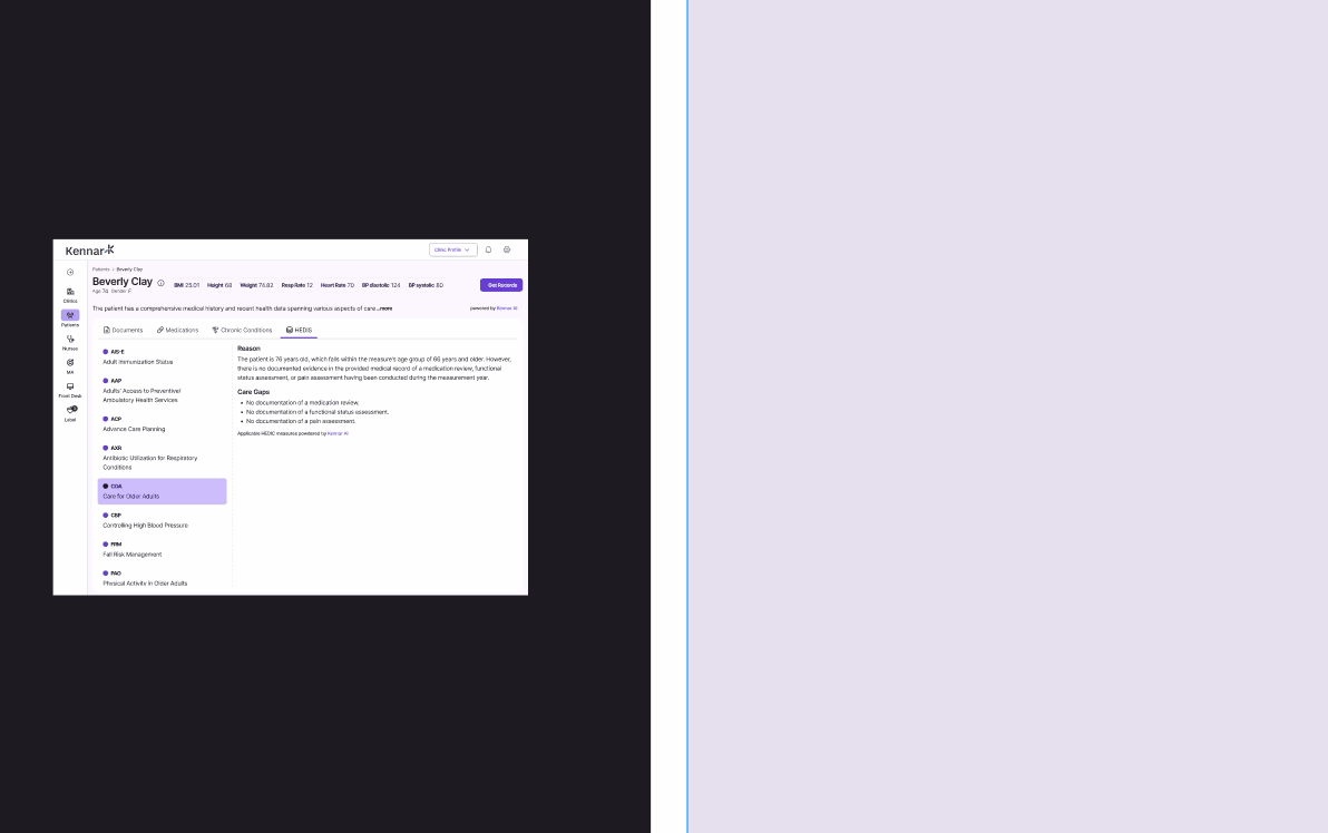
The journey from design conceptualization to full implementation was not without its challenges. Collaborating closely with the tech team, we navigated through the complexities of integrating the design system across all screens. This process involved continuous dialogue, iteration, and compromise, ensuring that our design vision was realized without compromising on functionality or performance.
It took a month to design and implement this across every screen on the app. With new and reusable components, we significantly saved bandwidth for both the tech and design teams.
Made with Love & Coffee
Updated on June 2025